
Each year the Pantone Colour Institute announces a colour for the year ahead. And many leading paint manufacturers have taken to announcing their own choice too.
Whatever the source, each is presenting to us a colour that they’re predicting home-makers will be embracing.
Needless to say, they won’t all be on the same hymn sheet. But between them they are likely to influence the two or three leading colors that will dominate our Pinterest and Instagram feeds as the year unfolds.
It’s interesting to be aware of this. And it’s also important to remember that it’s a trend with a limited timeline. Just twelve months, in fact, as a new color will be chosen for the following year.
The Pantone Colour Institute is recognised as a global leader in predicting color trends. According to their tagline, they unite the science and emotion of color. For this coming year, Pantone has actually selected a pair rather than a single color: Ultimate Gray and Illumuninating.

PANTONE 17-5104 Ultimate Gray and PANTONE 13-0647 Illuminating
“The union of an enduring Ultimate Gray with the vibrant Illimunating expresses a message of positivity, supported by fortitude. Practical and rock solid, but at the same time warming and optimistic, this is a color combination that gives us resilience and hope. We need to feel encouraged and uplifted; this is essential to the human spirit.” ~ Leatrice Eiseman, Pantone Color Institute
I get that, absolutely. And if this message resonates with you, then this color pairing is something to consider if you’re thinking about redecorating.
Just remember, next year this pairing will be so 2021.
The fact that trends change quickly isn’t the only reason to be wary of being overly influenced by them though.
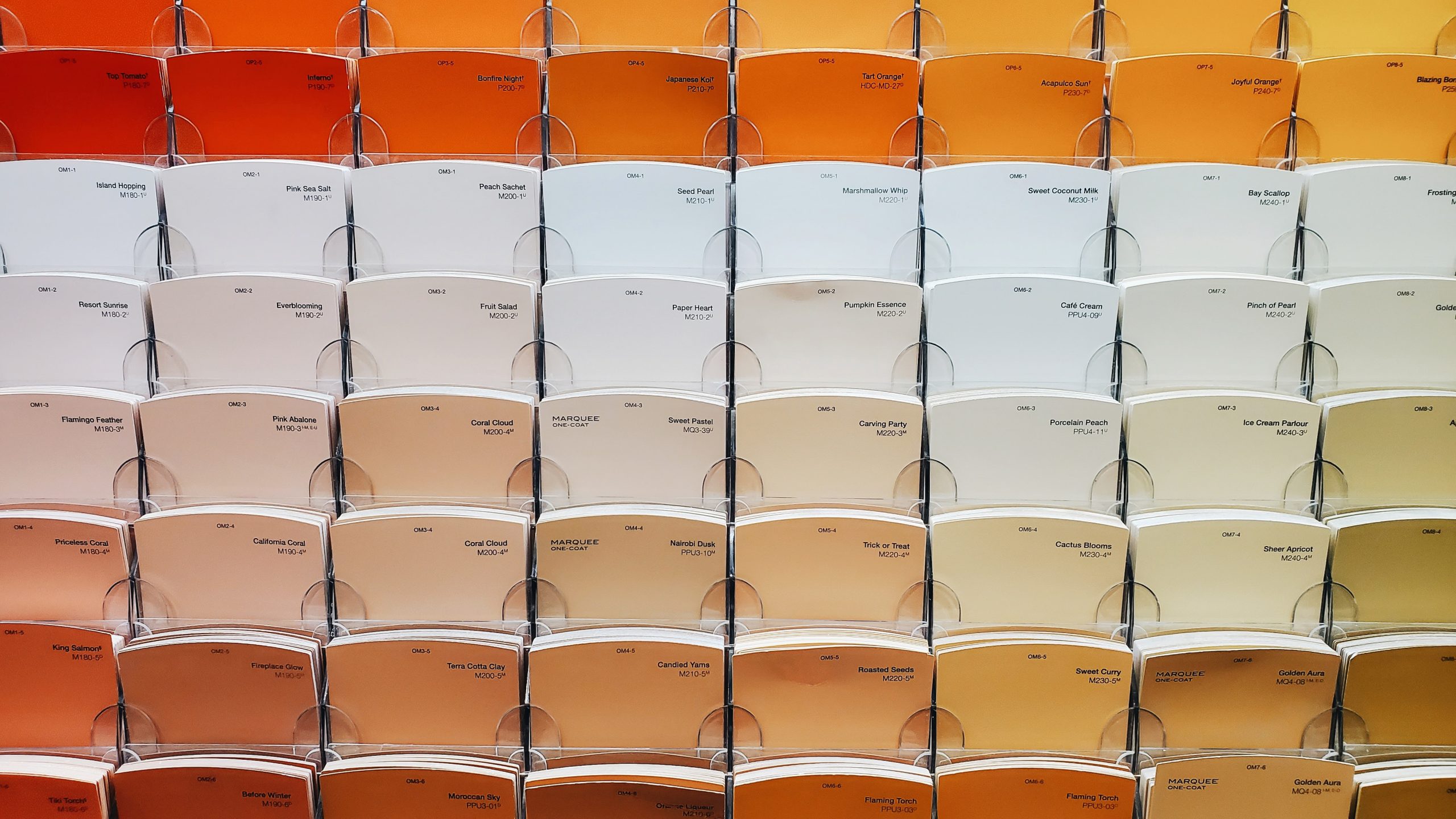
When it comes to choosing the color palette for your home, there are a few important questions to mull over. And the current trends shouldn’t even make it onto that list.
Absolutely, yellow is an uplifting colour. And grey is a grounding one. And both of those qualities could be more than helpful to many of us right now.
But that aspect of color psychology alone isn’t enough to ensure you end up feeling the way you want and need to feel in your space.
The primary considerations can be boiled down to three inter-related questions:
- What is the function of the space?
- What mood do you wish to create in the space?
- What colors appeal to you?
Colors have a significant impact on how we feel, which in turn influence how we engage with a space.
Those on the warmer side of the color wheel (reds, oranges, yellows) are recommended for use in rooms where we plan on being more lively. While those on the cooler side (blues and greens) are suggested for rooms in which we want to relax.
Therefore, whatever the color of the year is – in any given year – it will be limited in how useful it can be in helping us achieve these objectives.
Not to mention the fact, we just might hate all versions of the current color du jour.
Although I personally used a lemon and gray combination to decorate my bedroom in 1989, I wouldn’t be doing so now. A deep mustard hall would be more to my taste.
If this pairing appeals to you though, it could be a lovely choice for a kitchen or entryway. Or if you think too much yellow in your hallway woudl be overpowering, how about using it on the exterior of your front door?
Whatever your decision, personal taste should always trump the taste of the trend-makers.
As it turns out, Benjamin Moore’s color for 2021 is personally more appealing to me: Aegean Teal.

Teal is a color that I’m generally a fan of in most tints or shades. For me, this is a colour I could live with for a long time – in the right room.
Remember to ask yourself that: can you love it when it’s not the colour of the moment?
Teal leans from green-blue to blue-green, and any version of green or blue is a great choice for the times we’re living through too. The colors that dominate nature, they both help us to relax. So, it’s a great colour to use in a living room, bedroom, or even a study.
However, you do want to be mindful of the light in whatever room you’re thinking of using it in.
In the northern hemisphere, northerly-facing rooms have cooler light. This will bring out the cooler aspect of the colour.
You may need to find a more green, less blue-leaning teal. And before you make your final decision, get a few samples of teals that you like, and try them out in the room. On every wall.
Check how they appear and feel to you at different times of the day, but most particularly the time of day when you’ll use that room the most.
It can – and often does – turn out that a colour you theoretically love just doesn’t work for you in the room in question. In which case you’ll be back to the drawing board.
Which brings us back to the fundamental premise: forget the trend setters and choose for you.
First published on Newsbreak.com
You might also be interested in:
Key Colour Effects to Consider before Hitting the DIY Stores.