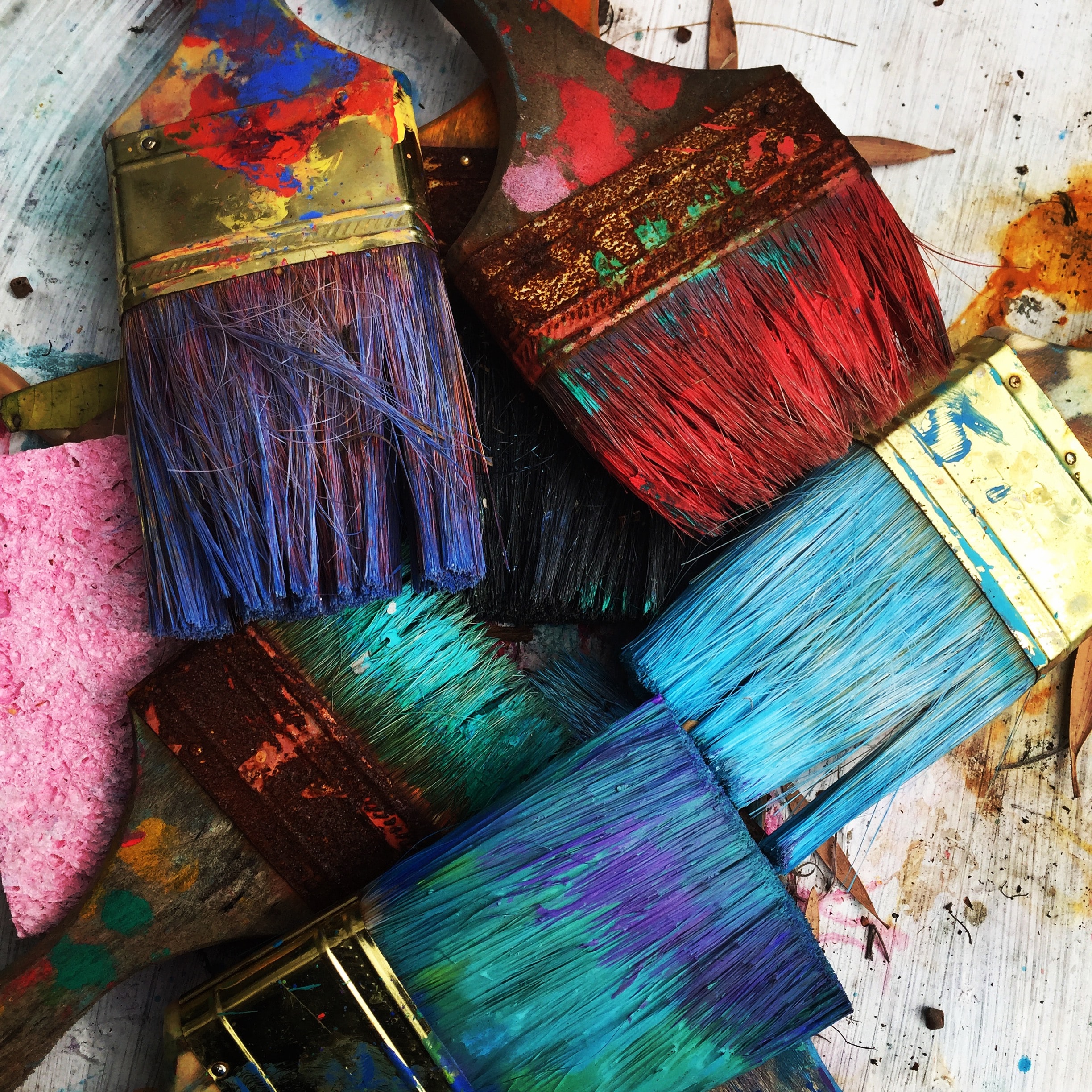


colour psychology
Paint is magical.
It has the power to transform the look of a piece of furniture – rescuing it from ugly, dated or very badly worn to beautiful, current, refreshed.
It has the power to transform how a room looks – making it seem larger, or cosier, than it really is.
But far more important than changing appearances, paint can transform the mood in a room. Cold and uninviting morphs into warm and welcoming. Dull can become interesting and engaging. Busy can become calm and restful.
And this effect isn’t isolated to the rooms we’re painting. We catch these feelings ourselves.
The colours that we paint the walls in our homes impacts on how we feel when we spend time within those walls.
So choose your paint colour carefully. Steer clear of the colour of the year, or other on-trend hues, and focus on finding the right colours that you will want to continue to surround yourself with for several years to come.
To get this right, we need to consider the function of each room, the personalities of the people using it, and the direction the natural light is coming from. Referring to colour psychology, the colour wheel and the compass will help us to choose a colour palette that supports our wellbeing.
Colour psychology
Generally speaking, colour psychology tells us we want to use warmer colours (reds, oranges, yellows) in rooms where we want the mood and atmosphere to be vibrant and stimulating. Kitchens and dining rooms are great examples where these colours can be put to good effect.
And in rooms where we want the mood to be relaxed and calming, then we want to move towards the cooler side of the colour wheel, making use of greens and blues. Our mood affects our behaviour, so think about what kind of behaviour you want to see happening in a room and choose a colour that will create a supporting mood for that.
Discussing the psychological properties of colour really deserves its own dedicated post (stay tuned). But here’s a general overview of what you want to be bearing in mind:
Red stimulates the body and mind and increases circulation. It’s a good choice in rooms where you want to stimulate lively conversation. It can also stimulate arguments, so consider this before adding it to the bedroom.
Yellow is thought to stimulate the nerves and purify the body. It’s an uplifting colour for most, associated with happiness. The wrong yellow (for you) can be difficult to spend time around, so choose carefully.
Orange increases energy levels. It’s a good choice in spaces where you want to spark creativity. Like yellow, it’s also uplifting and often associated with happiness.
Green is restful and subconsciously reminds us of nature. It’s used a lot in hospitals as it’s believed to aid healing. It’s a good choice for bedrooms and living rooms designed more for relaxing than socializing.
Blue soothes the psyche and is popular in bedrooms, medical waiting rooms, and other places where it’s important to ease anxiety. Many people associate it with a feeling of stability and safety. It is a cool colour and in northerly-facing rooms it can be more depressing than relaxing.
Purple is the colour of the imagination and is good for creative or contemplative spaces.
Pink is believed to have a calming effect and is often used in prisons and in ‘Away’ teams’ locker rooms – to calm prisoners and induce passivity in opposing teams.
White represents purity and cleanliness and can increase the sense of space in a room. It can also be cold and lend a sense of sterility. Undertones of warm colours can help to counteract this effect.
Black absorbs light and makes a space physically darker. This can induce feelings of sadness. It does depend on personality types though, and always worth considering using some black for someone with a winter personality type.
Seasonal personalities
Once you have a general idea of where you’re leaning in terms of colour choices, the next thing to consider is who uses each space in your home (or who uses it the most) – and at what time of day is it in use.
It’s time to look at the personality type of each member of your household, so you can choose a colour palette that works for everyone. Because lime green can be a nightmare to one person, and a zingy delight to another.
As well as providing guidelines on how different colours can affect our moods, colour psychology also helps us to choose colour palettes to suit different personality types. Using the four seasons to categorise, the idea is that we all have one dominant personality type, but probably also lean towards one or two supporting types. And different seasonal personalities have distinct preferences when it comes to colour, textures, patterns, furniture and other home décor.
You may be able to glean from the following descriptions what your primary and secondary types are. (I have a short, fun quiz on this link if you’d like a little help with it.)
Spring
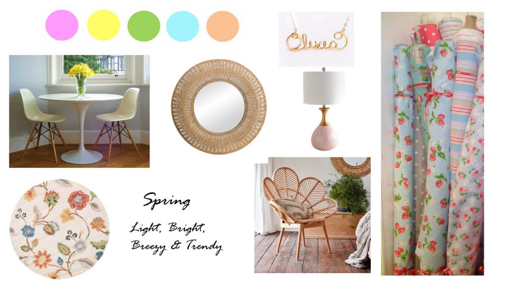
A Spring personality is practical, sensitive and caring, and often works in fields such as teaching, nursing, sales, communications or entertainment. They can be happy to stay in their chosen jobs for long periods.
They are fun, outgoing, young at heart, and have boundless charm and energy. Being creative and expressive, others are easily drawn to them – helped by the sense that they are also approachable and unpretentious.
Spring personalities love to be spontaneous and enjoy picnics, barbecues, and generally casual entertainment/social activities. They’re good at motivating others and multi-tasking.
Being open-minded they can be easily influenced (while also being influential), and impulsive. Spring types are most easily influenced by what’s trending in fashion and interiors and will change their style regularly. They make buying decisions quickly and are most prone to making expensive mistakes.
Colour-wise, they prefer tints (pure hue with white added) – and especially on the warmer end of the spectrum. Think delicate, lighter colours (pastels). However, they like their colours to be clear – not muddy tones. If it’s pink, or peach, you know which one. If it’s a pale green, you know it’s green and won’t mistake it for grey.
Overall, the mood of the Spring home will be light, fun, joyful, and optimistic – a casual and inviting space that lends itself well to spontaneous entertaining.
colour psychology
Summer
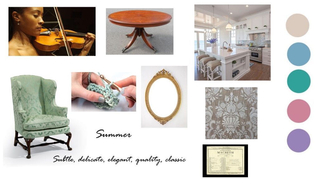
The Summer personality is quiet, calm, and reserved. They tend to have a subtle/dry wit, are highly perceptive, and are often softly-spoken. Career-wise, they make great doctors, human resource managers, diplomats, and (gifted) artists/musicians.
They love to study and will spend a long time in education. They’re brilliant listeners and have a well-developed sense of touch – love knitting, sewing, and highly detailed crafts.
They ooze grace and elegance, and their hosting/socialising style would reflect that. Often conservative, they can sometimes appear aloof to those who don’t know them well.
Their colour palette will be soft and soothing. They like subtle, cool, and muted tones and are especially attracted to blues, greens, and lilacs.
They’re not influenced by what’s on-trend and will always choose quality items that they will maintain in pristine condition for years to come.
The decor will be subtle, refined, pared-back, and of high quality – without being showy – and the overall atmosphere will be calm and relaxing.
colour psychology
Autumn
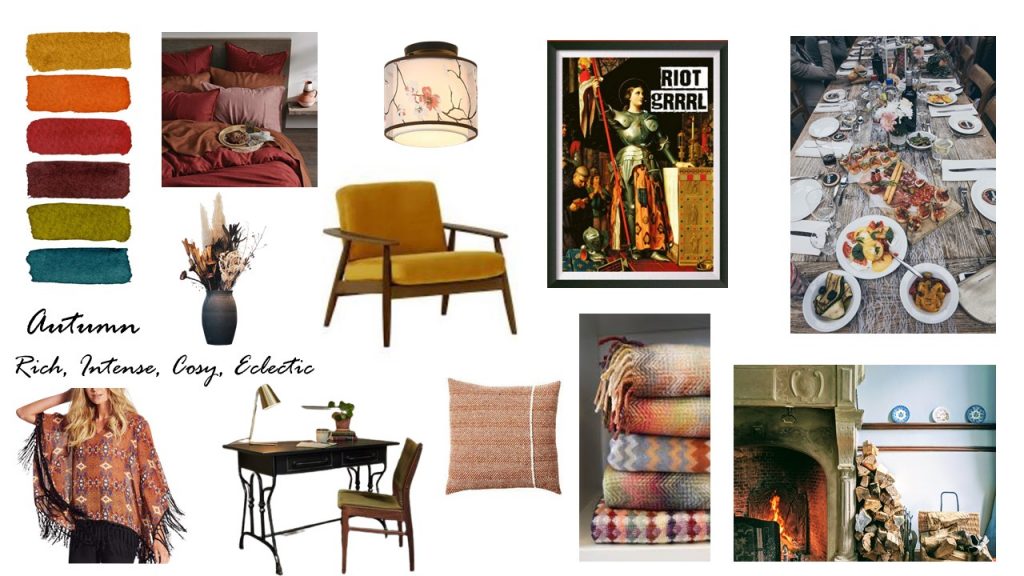
The Autumn personality type is earthy, warm, and caring. They’re interested in other people and make great psychologists. They’re also drawn to careers in investigative policing or journalism, archaeology, and design.
They tend to be intense, flamboyant, strong-minded, and rebellious. They are also environmentally aware and socially conscientious. They hate restrictions and question everything.
They love to spend time in nature and lean towards a casual and relaxed entertainment/socialising style. Comfort and substance are of utmost importance and will always be prioritised.
Their colour palette will be warm, intense, rich, dark, and moody. Their paint choices will be shades (pure hue with black added). An Autumn home will be layered – even if they’re paring things back to compromise with other personalities in the household. Bringing layers of texture, strong colours and mixed styles of furniture and furnishings, the overall vibe of an Autumn home is laid-back, casual, and grounded.
colour psychology
Winter
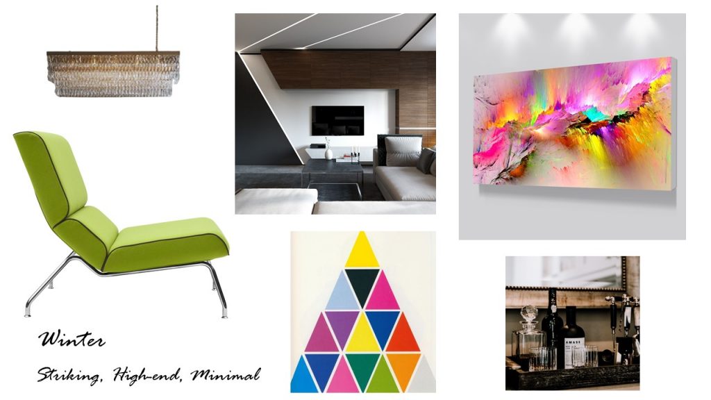
The Winter personality type is ambitious, self-assured, innovative, and driven. They tend not to seek others’ opinions, trusting in their own decision-making, and they always strive to be the best they can be.
Their career choices tend to include surgeon, barrister, government, and finance – at the highest level in their field.
When hosting, they will meticulously plan every detail in advance and the setting will be simple but stunning. They are minimalists at heart and everything is selected for efficiency.
They’re not small-talk people and can often be perceived as cold and unfriendly until you get to know them well (which can take time). They aren’t sentimental or sensitive – so they aren’t easily offended.
The colour scheme will be pared back but will have high contrast (for drama). Generally, they will opt for cool and/or piercing hues. A Winter home is designed to make a strong impression. For other personality types, it may feel austere, but for them the sleekness and lack of clutter are soothing.
The overall feeling will be undeniably luxurious, contemporary, and innovative.
Once you’ve identified what season you need to cater for in each room, along with what mood, you can move on to selecting specific colours for each space in your home.
Getting Specific About Colour Choice
There may be some blending of personality types to be considered in family rooms, and the secondary personality types can help you hit the right balance. For example, my dominant personality type is autumn, but I have a big dollop of spring in there too. So I can happily work with both those colour palettes, even though they are quite different.
The last step is to gather paint samples, and when you’re doing this you need to be mindful of the direction of the natural light in each room.
Here in the northern hemisphere, the brightest and warmest light comes from the south. A directly south-facing room will be bright for most of the day. In the middle of the day, depending on the amount of glass, it can even be dazzling.
Meanwhile, a directly north-facing room will almost always be relatively dull—even if you paint it white. If it’s northeast, however, you’ll have some warm light in the mornings, or in the evenings in a north-west facing space.
And the warmth (or lack of it) will affect the colours on the walls.
For example, green paint with a grey undertone will appear greyer in more northerly facing rooms. And in southerly facing rooms, the green will be more apparent. And that can also change throughout the day, as the light changes. The effect of the grey undertone may be more pleasing to someone with a summer personality compared to spring.
Take your time and get it right.
So you need to choose colour samples with the right undertones for the direction of light in the room they’ll be using. Go to a specialist paint store, rather than a general DIY shop and talk to them about this. And get their help to choose three samples that are close to the general colour you’re looking for. (Or book a colour consultation with an interior designer.)
This may seem like a tedious approach, but spending the extra time and money on sample pots will save you more time and money in the long run by helping you to pinpoint the right colour for the space, the first time. How a colour looks under the store lighting could be very different from how it will look in your home.
And it will look different on each wall, and at different times of the day. So you need to paint three swatches (two coats each) and put one on each wall. Put your three sample swatches up side-by-side (each clearly labeled) and leave them on the walls for several days.
Check them at different times of day, each day. This will help you to gain clarity on your preference, and especially note which appeals most at the time of day the room will be used most. Confer with other members of your household who will be using this space.
Patience with this step is key to nailing the colour choice. And this is important because once the room is painted in this colour it is going to impact your mood and behaviour. It will either draw you in to spend more time in the space or subconsciously repel you. And when you’re hanging out there, it will have an effect on your psyche.
Let that be a mindfully chosen effect that serves you well, and will continue to do so for many years.
Thank you for reading. You might also be interested in:
If you want to be notified whenever I post, be sure to subcribe to my newsletter.