

Last week Ireland’s House and Home magazine reported that their May/June issue was the best selling in ten years! Proof, if you needed it, that lockdown has significantly amplified the desire to update and upgrade our home décor.
I personally believe that loving our homes is an important self-care practice. That involves caring for it regularly on the basic level of cleaning, decluttering and organising. But it does also involve tweaking the décor until it feels right and makes our hearts sing.
When you look around your home, if you feel it needs updating in some way but you’re not quite sure how to give it that elevated touch, I’m going to share a series of tips to help with that.
In this first post, we’re going to look at colour, which has the power to dramatically change the look and feel of a space even if you don’t do anything else.
I’ve already written a couple of posts to help choose your colour palette, and they’re linked at the end of this one. So what we’re going to look at here is not so much what colours you choose, but some atypical ways to apply them that will give your décor that little extra touch.
Let’s start at the top.
When it comes to ceilings, white isn’t the only way to go. And if it is what you decide on, you can still make subtle changes to the typical white ceiling.
Interior designers regard the ceiling as “the fifth wall”. And we make a conscious choice as to what colour to paint it. That’s not to say we won’t go with white. Often—and more often than not—we will.
However, designers probably won’t go with the common “brilliant white”. Especially if the plan is to paint the walls white too. They’ll consciously choose a particular white from a particular brand because they love the particular effect that it has in rooms with the same orientation as the one they’re working on.
To give your own home that elevated touch, make deliberate choices about every colour you apply to every surface—including the ceiling.
If you’re painting it white, avoid “brilliant” and choose something a little softer. And if you’re painting the walls white, get several samples and test them on each wall in the room before you make your final choice. And then paint the ceiling in the same hue.
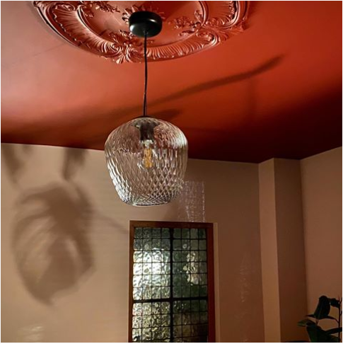
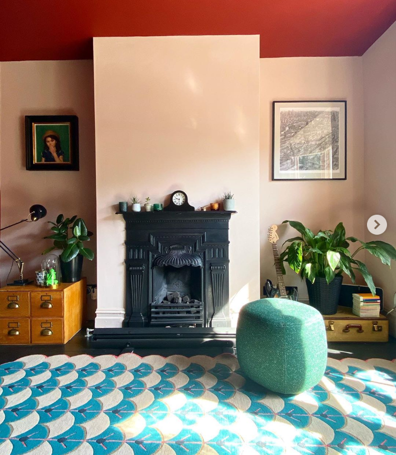
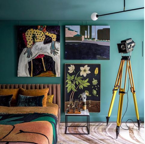
And if you want to get even bolder, consider using an actual colour on the ceiling instead of white! When a designer wants to make a strong statement in a room, this will be something they might include in the mix.
It’s a particularly good technique if you have a small, north-facing room that is never going to be a bright space no matter how many light-enhancing strategies you apply. You might hear a lot about “embracing the dark”, which designers will often recommend in these situations. It means intentionally designing the room to feel cosy and snug, instead of trying to make it feel lighter and brighter with pale colours, mirrors and other reflective surfaces.
If it’s a small space, with small windows and not getting any southerly light, going the cosy and snug route has the highest probability of success.
Painting the walls and ceiling a dark colour will help tremendously with that. But if that feels a bit too adventurous, you could paint the ceiling a paler tint of the wall colour, and still achieve that cave or womb-like feeling. It’s definitely something to consider, especially in rooms that are mostly used in the evening time.
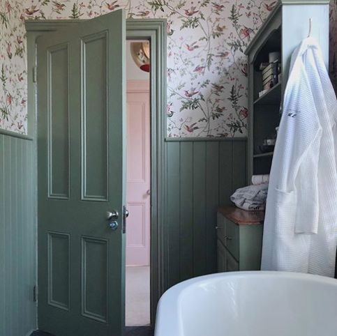
The Woodwork: Doors, Architraves and Skirting Boards.
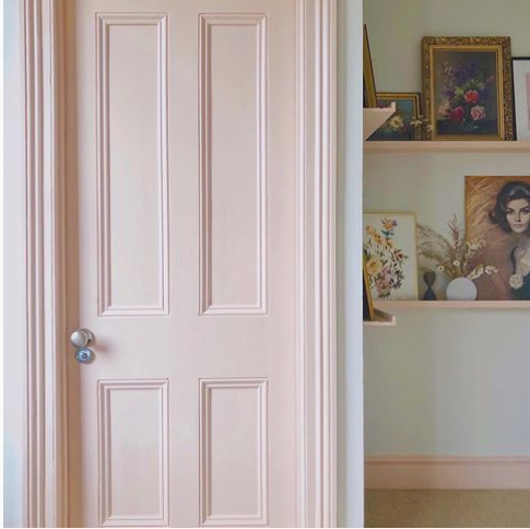
For all of these surfaces white, again, is usually the default choice. For many of us, we didn’t even choose it. It was the builder’s finish and we’ve never thought to change it. When refreshing was required we simply stuck with the white.
As with ceilings, I’m not saying to abandon white altogether. It really does depend on your wall colour. For example, if the walls are grey, then white doors and trims will look really smart beside them. I’m just saying, make a deliberate choice. There are lots more options besides white and natural wood. If your walls are green, search Pinterest for “green living room” and see what others have done with their doors and woodwork. Look for something that gives you a little lift and makes the décor around it sing.
Opting for colour instead of white on any of these surfaces will have an impact. If the room is on the small side and you want to increase the sense of space in it, then painting the doors, skirting, architrave and ceiling the same colour is a great trick to apply. It blurs the boundaries of the room, whereas a white ceiling and doorway make them very clear.
If you’re not concerned about creating a more spacious feeling, then think about using a contrasting colour for either the doors and trims, or the ceiling (or both), for a very dramatic impact.
Most importantly, think about what kind of feeling you want people to experience when spending time in the room and choose your colour palette accordingly. (More information on that in the blog posts linked below.)
For a restful feeling, choose an analogous colour, and if you want a more energised feeling then go with a complimentary colour. (Analagous colours sit beside each other on the colour wheel. Complimentary colours sit opposite each other – see “monochrome” post for more details.)
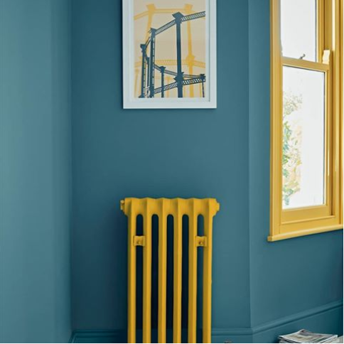
The dreaded radiator.
Maybe you’re lucky enough to have attractive feature radiators in your home. In that case, have fun with your colour choice. I would want it to stand out from the wall, for sure!
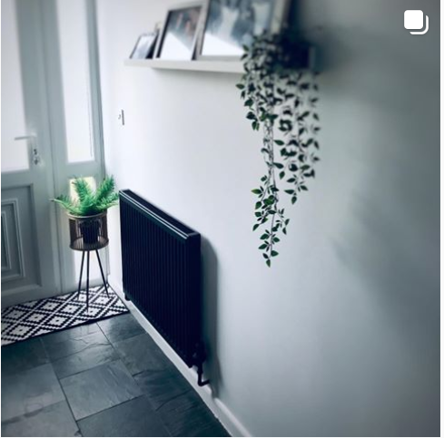
However, for the majority of folks who are living with the bog standard ugly radiator, then the simplist solution is to paint them the same colour as the walls.
Then, instead of detracting from our décor, they blend in and becomes less obvious as the eye travels around the room. We usually don’t want these kinds of radiators to stand out, and if we leave them white, against a coloured wall, that’s exactly what they’re going to do.
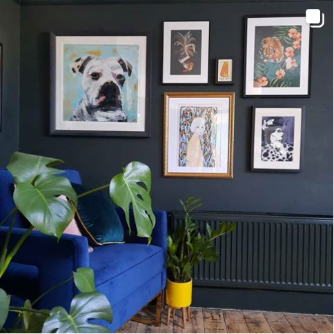
That said, you could go the opposite route entirely. To be really playful and dramatic, you could paint the common (ugly) radiator in a contrasting colour, transforming it into a feature. Suddenly, it’s no longer an ugly obtrusion into the overall scheme, but an interesting element that adds to the overall effect.
But coming back to the original point, unless it’s a feature radiator or the wall is white, then the radiator must be intentionally painted to work with the décor. Even if it is currently hiding behind a sofa….should you decide to switch up the layout, your ugly radiator may become exposed.
We’ll look at layout in a subsequent post, as well as some other topics. For now, following are the other posts on colour that I’ve referred to. I hope you find them helpful:
Key Colour Effects to Consider Before Hitting the DIY Stores.